
Do you know how many websites are present on the internet? About 1.7 billion so far as per the stats.
And do you know what’s the most impressionable element in a website that makes your readers stay on your website?
If you guessed a good website design, you are right!
For any blog/website, one of the most engaging factors for any reader is the provision of a great design.
Your website is like a dish that is solely dependent on the presentation to the critics. And while your dish could be immaculate, if you don’t have a good presentation, you might as well forget about the good reviews coming your way.
Good website design is one of the most important elements that lead to a reader remembering your site.
The importance of a great website design
For a business that sells its product online, your website is something that appears first. So if you are expecting people to visit your store and buy products/services from you, you need to build your website/blog properly first.
An effective website design has the ability to have a proper content and website structure along with having suitable navigation options.
There are a bunch of factors that contribute to good website design:
- Typography
- Website backgrounds
- The font style/color
- Content structure
- The functionality of every feature
A unique and distinct website design has a significant impact on how your website and the content is perceived by a user. Not only is a good design appreciated by your readers, but it could also help you with your search engine rankings.
A good website design along with a proper structure has a massive impact on how your brand is reflected.
Promoting a great user experience with your business helps you in retaining your readers and probably visit again the next time your website appears in the search results.
A reader’s approach to your website design
Your customers are firstly your readers, so it’s okay to consider all your website visitors as your readers.
These very readers deal with your content. They scan the entire website and look for content related to their query. If the content they are looking for is presented in such a way that it not only is easier for them to find, but they even found very interesting things about the same query, they are going to have a positive experience with your website.
Basically, users’ habits on the web aren’t that different from customers’ habits in a store. Visitors glance at each new page, scan some of the text, and click on the first link that catches their interest or vaguely resembles the thing they’re looking for. In fact, there are large parts of the page they don’t even look at.
Most users search for something interesting (or useful) and clickable; as soon as some promising results are found, they click. If the new page doesn’t meet users’ expectations, the back button is clicked and the search process is continued.
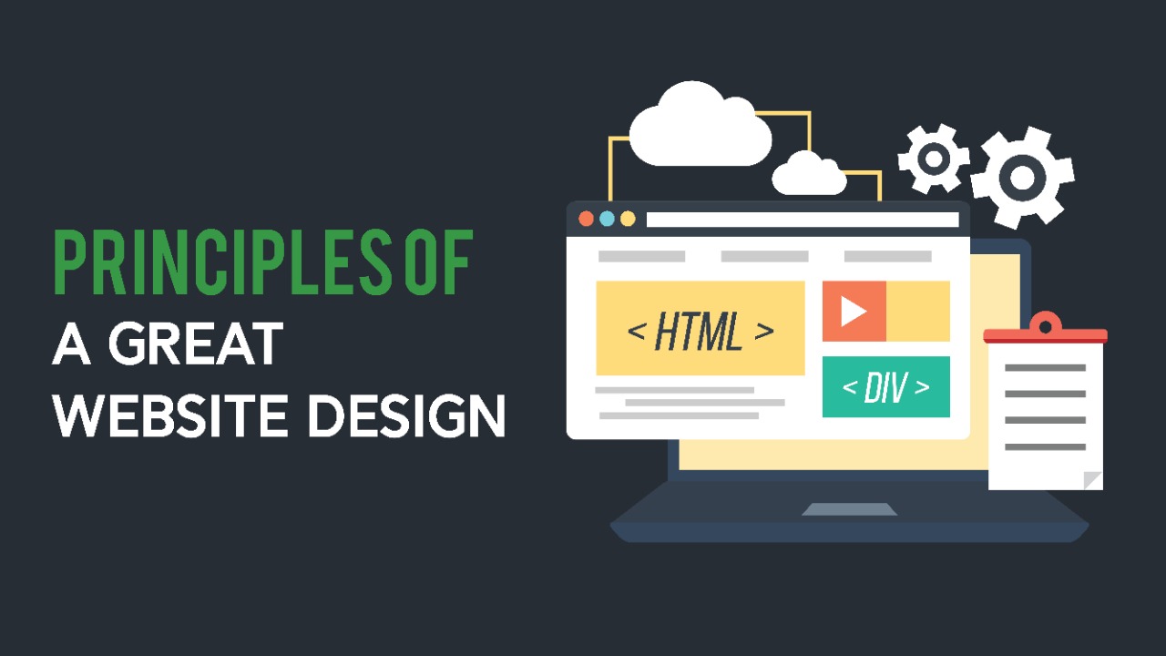
Principles of a great website design
A great website is built with the combination of a variety of elements that you just can’t let slide.
If you ever intend on making your project a success, ensure that you are considering the following factors as well:
- Apply a great website theme
- Don’t bombard your website with popups
- Let your website grab the users’ attention
- Work on the website typography
- Easy Navigation
- Let the people reach you
- Develop a mobile-friendly website
- Easy Website Loading
How to build a great website design?
Since you are on the hunt for great website design, take a note that you have to tweak your website/blog just so you could get it right.
And here’s how you do it.
1. Apply a great website theme

The theme of your website has the MOST influence on the entire design and structure of your website.
For any visitor on your website, the first thing they notice is how perfectly your website is structured. And since your theme has a great influence on your website, I recommend you be as picky as possible.
A website theme (also known as a template) needs to be as perfect and suitable as possible. Looking at any of the top-tier websites and platforms, you’d notice that all of them have a very distinct theme. If you are trying to build a separate identity for your website, you need to have a very distinct theme as well.
Any platform you use to host your website provides the option of changing the theme of the website.
This means there are a variety of options for you to settle for.
If you are using WordPress or similar blogging platforms, you would know that changing a theme is as easy as anything. However, what you also need to realize that the same theme needs to be customized as perfectly as possible so that it complements your website as well.
Nothing suits a website better than a great theme. If you are able to develop your theme the same way, you are potentially encouraging positive feedback from your viewers regarding your design.
2. Don’t bombard your website with popups (and ads)

Do you know that an average user has about 4 seconds of attention span? If they don’t reach the content they want, they are most likely to click away.
The same happens when your site has all these ads and extra details surrounding it.
Prompting the email registration or ad banners on your website is okay. In fact, it’s how you make money off of it after all.
However, the excessive use of such banners (2 being excessive) could have a negative effect on your website design and audience retention.
A website visitor, especially a new one, is usually very impatient when it comes to accessing the content they are looking for.
When they enter your website, they expect to reach the content as soon as they click your site in the search results.
However, if you are hurdling their access by displaying a bunch of email registration popups, selling a product, asking them to accept cookies at the same time, or even displaying an ad that covers most of the content, what are the chances they are going to stay, press the ‘X’ button and read your content?
Keep the extra things on your website to a minimum. And if you are still adamant about displaying these important popups, the best thing that you could do is to trigger a few of these popups after certain actions from the user.
Let’s say you can trigger the ‘Email subscription popup’ after the user has surfed halfway through your website. In a similar way, as a user is progressing towards closing your tab, you can display an advertisement or a similar popup you want.
Display these things systematically. Don’t make your impatient users grow more impatient because of the extra elements on your site.
3. Let your website grab the users’ attention
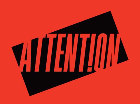
Your website is basically space for you to bag as many users as possible. It features static and dynamic content, both that could be used to seek the attention of your users.
While images are a big help in this case, the use of bold text helps with readability as well.
Bold text can make your content very attractive. However, if you overdo it and use it in every other sentence, it loses its essence.
The same goes for the Italic text.
Any reader could instantly recognize things like edges, motions, flashy animations, or simple GIFs that you use in your content.

Content that can capture the users’ attention also includes bolding and increasing the size of specific keywords just so as to make the user check out the ad or a particular section of your content.
You often see such strategies being played by marketers and advertising agencies all across the internet.

To make any of your particular segment or area of your website more presentable, use the right kind of text, and highlight the most important parts accordingly.
Words like ‘Free, Extra, NOW’ could be used to fetch the attention of your readers instantly.
4. Work on the website typography
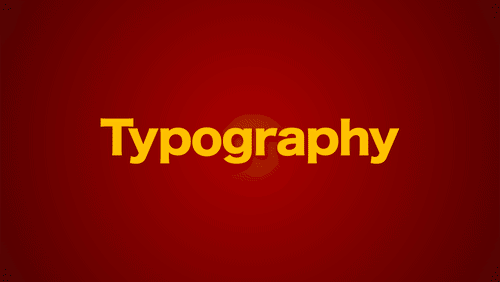
No matter how many ranking signals you are using, the text on your website still is one of the most important things. Since the same text is very much familiar to the search engine crawlers, it contributes to the entire SEO of your website.
The text on your website is how you communicate with your users.
Sure, videos and infographics help too, but they are not as flawless and effective as regular website text.
A great website design is equally balanced when it comes to maintaining a great design and great content as well.
The use of the right font at the right place could help you a long way. And to ensure that, here are a few guidelines you could adopt.
- Maintain a uniform font throughout your entire website. If you are using one font type on one page, use it on the rest of the pages of your website as well.
- For you to highlight certain parts of your content, feel free to use a different font, maybe even italicize it. Colors and unique font styles help a lot.
- Try to use fonts that are easier to load up. Some of the fonts like Haettenschweiler and Monotype Corsiva could, however, be hard to read on some screens.
5. Easy Navigation
Navigation refers to establishing a proper finding system that allows your users to find what they are looking for within your content.
If you have been keeping up with Dothacks, you already know we are super obsessed with good navigation.
For example, in our Google Ads Guide, we made the navigation super easy and convenient for our readers.
Similarly, if you want a great website layout, you would not want to miss proper navigation too.
If a user isn’t able to understand the layout of your website or find it hard to find what they are looking for, they are not likely to revisit your site.
For a great navigation system, ensure that you either have a ‘Table of Contents’ plugin activated, or enter the menu anchors by yourself.
The key to having a good website layout and design is by keeping the navigation simple and consistent on every page of your website.
6. Let the people reach out to you

Communication is the key to a successful business.
The more communication methods you promote on your platform or business, the more credible it becomes with time.
If you own a website/blog or any similar kind of a platform, providing an open communication channel for your viewers is one of the best ideas to make it trustworthy.
Often, businesses don’t really pay much attention to their communication lineup, which is a common mistake.
- If you have a simple single-author blog, having a ‘Contact Us’ page would be fine where your viewers could reach you through e-mails or your social media profiles.
- However, if you are a business, having a chatbot and a great ‘Contact Us’ landing page that displays your business emails and phone numbers is a necessity.
The more options you provide for people to reach out to you, the better it is for your business.
7. Develop a mobile-friendly website
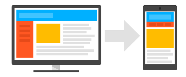
Do you know that about 51% of internet users use their mobiles to access the internet? That is a huge market to target.
In case your website isn’t aimed towards mobile users, you are letting go of half of your traffic.
It’s important to develop your website in such a way that it has its own mobile version that is equally better as the desktop or tablet version of your website.
And this is not only important for readability. This is also important for your entire website SEO.
If you remember, in my previous on-Page SEO guide, I mentioned that Google doesn’t really prefer displaying websites in the top results of SERPs if they aren’t mobile-friendly.
Serving your content across multiple platforms is only going to help you increase your traffic because most of the users now use mobiles to access the internet. Why? Because it’s convenient.
If a user isn’t satisfied with your website layout on their mobiles or it has trouble loading up, it’s only going to hurt your SEO since they are going to click away. This eventually has an influence on the bounce rate of your site.
8. Easy Website Loading

As I mentioned above, readers have an attention span of 4 seconds on average. This means that if your websites take more time than that to load up, they are going to hit the ‘back’ button and look for a different option.
To test the speed of your website, use the PageSpeed Insights from Google which helps you find out the loading time of your site across multiple platforms. The best part is that it even provides suggestions for improvement and how you could potentially decrease the loading time of your site.
To make your site the fastest and get a perfect score is kind of difficult if you don’t have adequate knowledge about CSS or different styling elements of your site.
However, you could definitely do it in other ways. This includes optimizing the mages in your content, moving to a faster server, and even compressing the HTML and JavaScript files to speed up your website.
OVER TO YOU
By this point, I am sure you equally agree that website design and layout are dependent on a variety of factors that you can’t miss.
If you ever dream to have a top-tier website, the entire structure is going to have a lot of impact on it.
Hope you found these tips useful.
Come hang out with us on Instagram. We will provide you some of the best tips there as well.